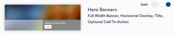
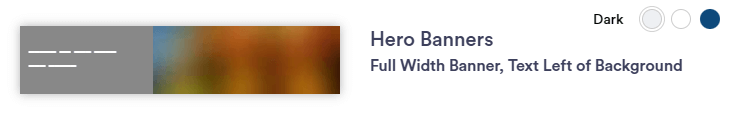
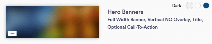
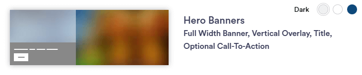
| TWM Section Description & Preview |
Requred/Optional Elements |
Section Capabilities |
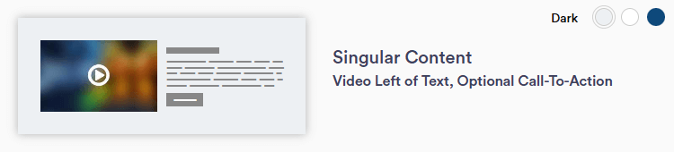
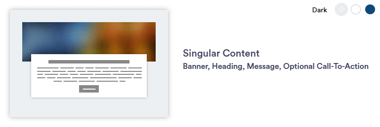
Singular Content 1
Banner, Heading, Message, Optional CTA
|
Required
- Background color
- Justification (Left, Center, Right)
- Image (minimum size = 1920 x 400px)
Optional
- Title and/or paragraph(s)
- Headline(s)
- Disclaimer
|
Section Capabilities
- Message section overlays the image with white box
- Use with larger photos that are flexible in display
- Depending on screen size, the image will display differently behind the box (responsive, not static)
- Can add hyperlinks within paragraph text
|
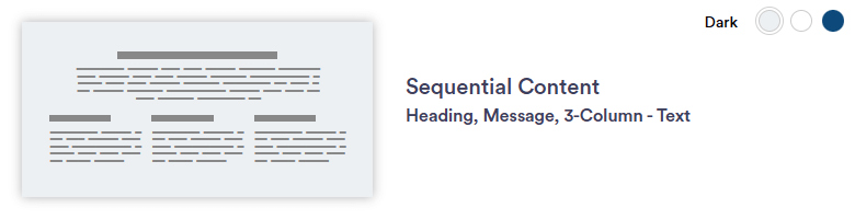
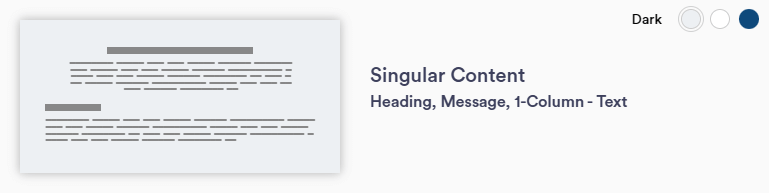
Singular Content 2
Heading, Message, 1-Column - Text
|
Required
- Background color
- Justification (Left, Center, Right)
- Top and bottom message
Optional
- Title and/or paragraph(s)
- Headline(s)
- Disclaimer
|
Section Capabilities
- Top paragraph's width stays smaller than the bottom paragraph
- Can center-align top message area and keep bottom message left justified.
- Use this section for text-heavy pages or as introduction to other sections on a page.
- Can add hyperlinks within paragraph text
|
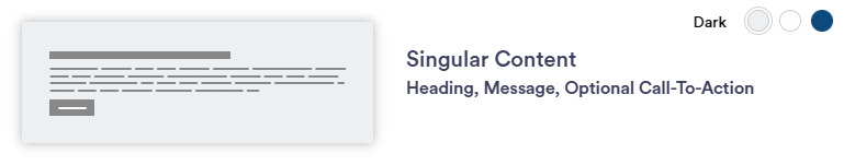
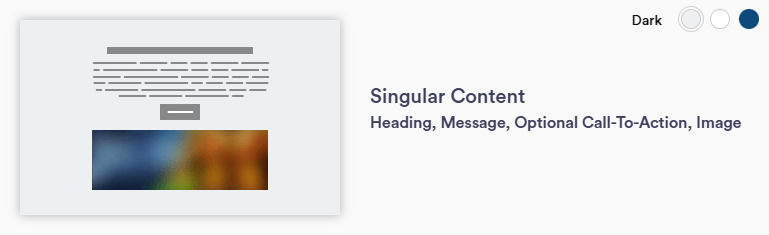
Singular Content 3
Heading, Message, Optional CTA
|
Required
- Background color
- Text Justification (Left, Center, Right)
Optional
- Title or paragraph
- Headline(s)
- CTA
- Background image (any size)
- Disclaimer
|
Section Capabilities
- With a background image, the text box background is white
- Use this section to highlight a paragraph on a page
- Can add hyperlinks within paragraph text
|
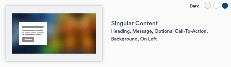
Singular Content 4
Heading, Message, Optional CTA, Background, On Left
|
Required
- Background color
- Text Justification (Left, Center, Right)
Optional
- Title or paragraph
- Headline(s)
- CTA
- Background Image (minimum size = 1920 x 800px)
- Disclaimer
|
Section Capabilities
- With a background image, the text box background is white
- Text stays in square to the left of the page
- Background image with this section is highly encouraged
- Choose a photo that is flexible in appearance
- Content cannot be added to space next to text box
- Can add hyperlinks within paragraph text
|
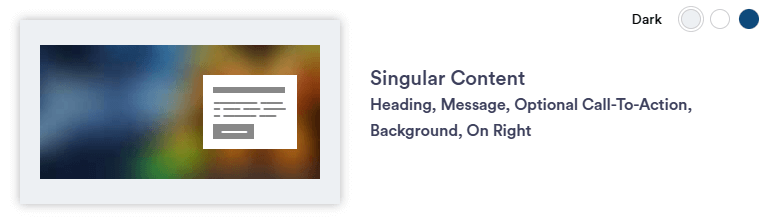
Singular Content 5
Heading, Message, Optional CTA, Background, On Right
|
Required
- Text Bar background color
- Justification (Left, Center, Right)
Optional
- Title or paragraph
- Headline(s)
- CTA
- Background Image (minimum size = 1920 x 800px)
- Disclaimer
|
Section Capabilities
- With a background image, the text box background is white
- Text stays in square to the right of the page
- Background image with this section is highly encouraged
- Choose a photo that is flexible in appearance
- Content cannot be added to space next to text box
- Can add hyperlinks within paragraph text
|
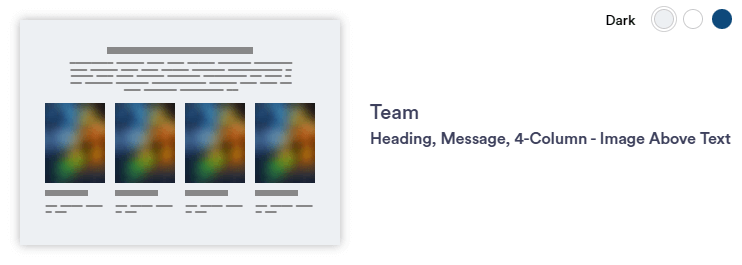
Singular Content 6
Heading, Message, Optional CTA, Image
|
Required
- Background color
- Text Justification (Left, Center, Right)
- Horizontal Image - 1110x735px
Optional
- Title or paragraph
- Headline(s)
- CTA
- Disclaimer
|
Section Capabilities
- Image appears as wide as the paragraph text on the page
- Use to: Introduce a team or highlight a photo.
- The text box background is white on all background color choices.
- Can add hyperlinks within paragraph text
|
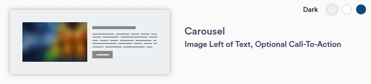
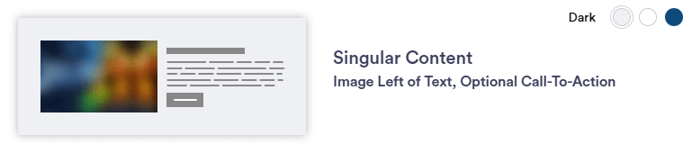
Singular Content 7
Image Left of Text, Optional CTA
|
Required
- Background color
- Justification (Left, Center, Left)
- Horizontal Image - 1110x735px
Optional
- Title or paragraph
- Headline(s)
- CTA
- Disclaimer
|
Section Capabilities
- Commonly used section
- Alternate on page between left and right section layout (Singular Content 9)
- Can add hyperlinks within paragraph text
|
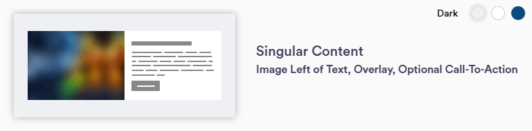
Singular Content 8
Image Left of Text, Overlay, Optional CTA
|
Required
- Background color
- Justification (Left, Center, Right)
- Horizontal Image - 1110x735px
Optional
- Title or paragraph
- Headline(s)
- CTA
- Disclaimer
|
Section Capabilities
- Image appears wider than the white box/message area
- White text box overlays larger background image to the left
- Use with larger photos that are flexible in display
- Depending on screen size, the image will display differently behind the box (responsive, not static)
- Can add hyperlinks within paragraph text
|
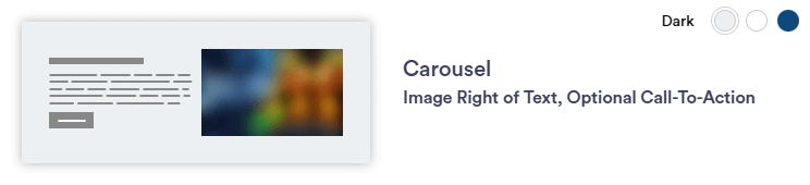
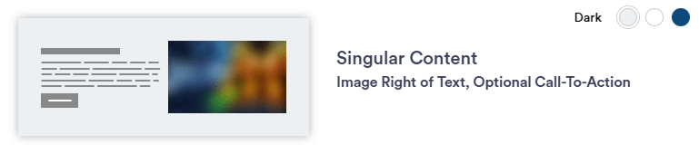
Singular Content 9
Image Right of Text, Optional CTA
|
Required
- Background color
- Justification (Left, Center, Right)
- Horizontal Image - 1110x735px
Optional
- Title or paragraph
- Headline(s)
- CTA
- Disclaimer
|
Section Capabilities
- Commonly used section
- Alternate on page between left and right section layout (Singular Content 7)
- Can add hyperlinks within paragraph text
|
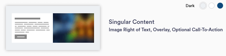
Singular Content 10
Image Right of Text, Overlay, Optional CTA
|
Required
- Background color
- Justification (Left, Center, Right)
- Horizontal Image - 1110x735px
Optional
- Title or paragraph
- Headline(s)
- CTA
- Disclaimer
|
Section Capabilities
- Image appears wider than the white box/message area
- White text box overlays larger background image to the right
- Use with larger photos that are flexible in display
- Depending on screen size, the image will display differently behind the box (responsive, not static)
|
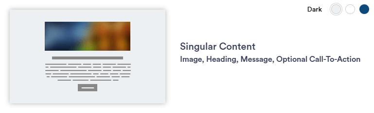
Singular Content 11
Image, Heading, Message, Optional CTA
|
Required
- Background color
- Justification (Left, Center, Right)
- Horizontal Image - 1110x735px
Optional
- Title or paragraph
- Headline(s)
- CTA
- Disclaimer
|
Section Capabilities
- Image appears as wide as the paragraph text on the page
- Use to: Introduce a team or highlight a photo.
- The text box background is white on all background color choices.
- Can add hyperlinks within paragraph text
|
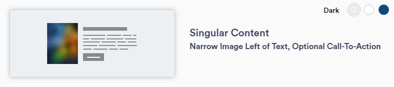
Singular Content 12
Narrow Image Left of Text, Optional CTA
|
Required
- Background color
- Justification (Left, Center, Right)
- Vertical image - 483 x 600px
Optional
- Title or paragraph
- Headline(s)
- CTA
- Disclaimer
|
Section Capabilities
- Commonly used section
- Alternate on page between left and right section layout (Singular Content 14)
- Can add hyperlinks within paragraph text
|
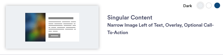
Singular Content 13
Narrow Image Left of Text, Overlay, Optional CTA
|
Required
- Background color
- Justification (Left, Center, Right)
- Vertical image - 483 x 600px
Optional
- Title or paragraph
- Headline(s)
- CTA
- Disclaimer
|
Section Capabilities
- Image appears wider than the white box/message area
- White text box overlays larger background image to the left
- Use with larger photos that are flexible in display
- Depending on screen size, the image will display differently behind the box (responsive, not static)
|
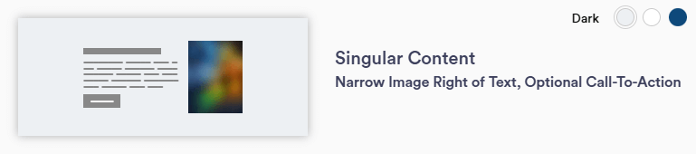
Singular Content 14
Narrow Image Right of Text, Optional CTA
|
Required
- Background color
- Justification (Left, Center, Right)
- Vertical image - 483 x 600px
Optional
- Title or paragraph
- Headline(s)
- CTA
- Disclaimer
|
Section Capabilities
- Commonly used section
- Alternate on page between left and right section layout (Singular Content 12)
- Can add hyperlinks within paragraph text
|
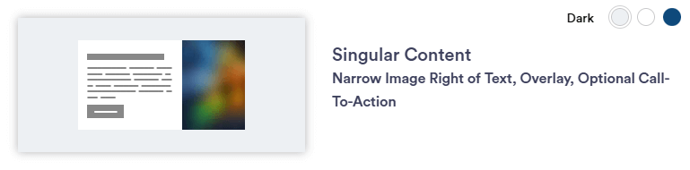
Singular Content 15
Narrow Image Right of Text, Overlay, Optional CTA
|
Required
- Background color
- Justification (Left, Center, Right)
- Vertical image - 483 x 600px
Optional
- Title or paragraph
- Headline(s)
- CTA
- Disclaimer
|
Section Capabilities
- Image appears wider than the white box/message area
- White text box overlays larger background image to the right
- Use with larger photos that are flexible in display
- Depending on screen size, the image will display differently behind the box (responsive, not static)
|