Highlights 2
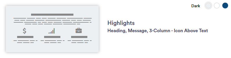
Highlights 2 section layout allows for a headline, message, and highlight tiles in a 3-column format. Highlight tiles are separate from one another, allowing for diverse and engaging content. Each highlight tile flips when the mouse hovers over it and can have different CTAs. For optimal layout, use six tiles. This section is ideal for content such as blogs or newsletters.
Continue reading to explore the required and optional elements for this section. Scroll down to view samples of this section in Dark, Light, and Primary (blue) color options available in TWM.
Required Elements
- Background color
- Justification (Left, Center, Right)
- Highlight tiles
- Title and message
- minimum needed = 3
Optional
- Intro title and/or paragraph
- Icons
- CTA(s) - button or text
- Disclaimer
Section Capabilities
- Highly recommend use of Icons
- Select icons from the NM library
- Suggested amount of tiles: 6
- Content idea: blog/newsletters
- Highlight flips when mouse hovers over square
- Highlight tiles are separate from one another
- Can have different CTAs per tile