Resources 1
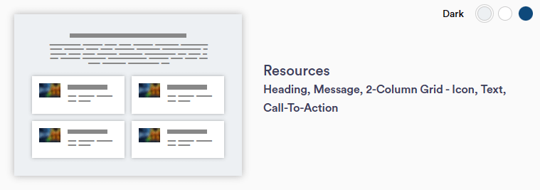
Resources 1 section layout allows for a headline, message, and highlight tiles in a 2-column grid format. Highlight tiles are separate from one another, allowing the display of multiple resources. Each highlight tile allows for the selection of an icon, title, text, and a CTA button. NOTE: This section can only be used once per page.
Continue reading to explore the required and optional elements for this section. Scroll down to view samples of this section in Dark, Light, and Primary (blue) color options available in TWM.
Required Elements
- Background color
- Justification (Left, Center, Right)
- Affects entire section
- Resource title (at least two)
- Icons
Optional
- Intro title and/or paragraph
- Resource paragraph
- Accordion menu(s)
- CTA(s) - button or text
- Add per resource
- Disclaimer
Section Capabilities
- Use to display other links or documents
- Content idea: blog/newsletters
- Select icons from the NM library
- Can display multiple resource entities
- Recommended: use an even number of resources for best display in a 2-col layout
- Can only use this section once per page
Heading and Message Subtitle
Heading and Message Title - Left
Heading and message left justified. Duis aute irure dolor in reprehenderit in voluptate velit esse cillum dolore eu fugiat nulla pariatur.
Resources 1 Title
Duis aute irure dolor in reprehenderit in voluptate velit esse cillum dolore eu fugiat nulla pariatur. Excepteur sint occaecat cupidatat non proident, sunt in culpa qui officia deserunt mollit anim id est laborum.
Learn MoreResouces 2 Title
Velit esse cillum dolore eu fugiat nulla pariatur. Excepteur sint occaecat cupidatat non proident, sunt in culpa qui officia deserunt mollit anim id est laborum.
Learn MoreResources 3 Title
Lorem ipsum dolor sit amet, consectetur adipiscing elit, sed do eiusmod tempor incididunt ut labore et dolore magna aliqua.
Learn MoreThis is an example of the disclaimer text. This is an optional element in most cases.
Heading and Message Subtitle
Heading and Message Title - Center
Heading and Message Center Justified. Duis aute irure dolor in reprehenderit in voluptate velit esse cillum dolore eu fugiat nulla pariatur.
Resources 1 Title
Duis aute irure dolor in reprehenderit in voluptate velit esse cillum dolore eu fugiat nulla pariatur. Excepteur sint occaecat cupidatat non proident, sunt in culpa qui officia deserunt mollit anim id est laborum.
Learn MoreResouces 2 Title
Velit esse cillum dolore eu fugiat nulla pariatur. Excepteur sint occaecat cupidatat non proident, sunt in culpa qui officia deserunt mollit anim id est laborum.
Learn MoreResources 3 Title
Lorem ipsum dolor sit amet, consectetur adipiscing elit, sed do eiusmod tempor incididunt ut labore et dolore magna aliqua.
Learn MoreThis is an example of the disclaimer text. This is an optional element in most cases.
Heading and Message Subtitle
Heading and Message Title - Right
Heading and Message Right Justified. Duis aute irure dolor in reprehenderit in voluptate velit esse cillum dolore eu fugiat nulla pariatur.
Resources 1 Title
Duis aute irure dolor in reprehenderit in voluptate velit esse cillum dolore eu fugiat nulla pariatur. Excepteur sint occaecat cupidatat non proident, sunt in culpa qui officia deserunt mollit anim id est laborum.
Learn MoreResouces 2 Title
Velit esse cillum dolore eu fugiat nulla pariatur. Excepteur sint occaecat cupidatat non proident, sunt in culpa qui officia deserunt mollit anim id est laborum.
Learn MoreResources 3 Title
Lorem ipsum dolor sit amet, consectetur adipiscing elit, sed do eiusmod tempor incididunt ut labore et dolore magna aliqua.
Learn More